Chun Feng Man Mian
FOOD PHOTOGRAPHY | BRANDING
FOOD PHOTOGRAPHY| Branding
Photographer & Creative Director: C.R Tan
Photography Assistant: Ting Li
Copywriter: Claire Chin
Designer: Dan Chia
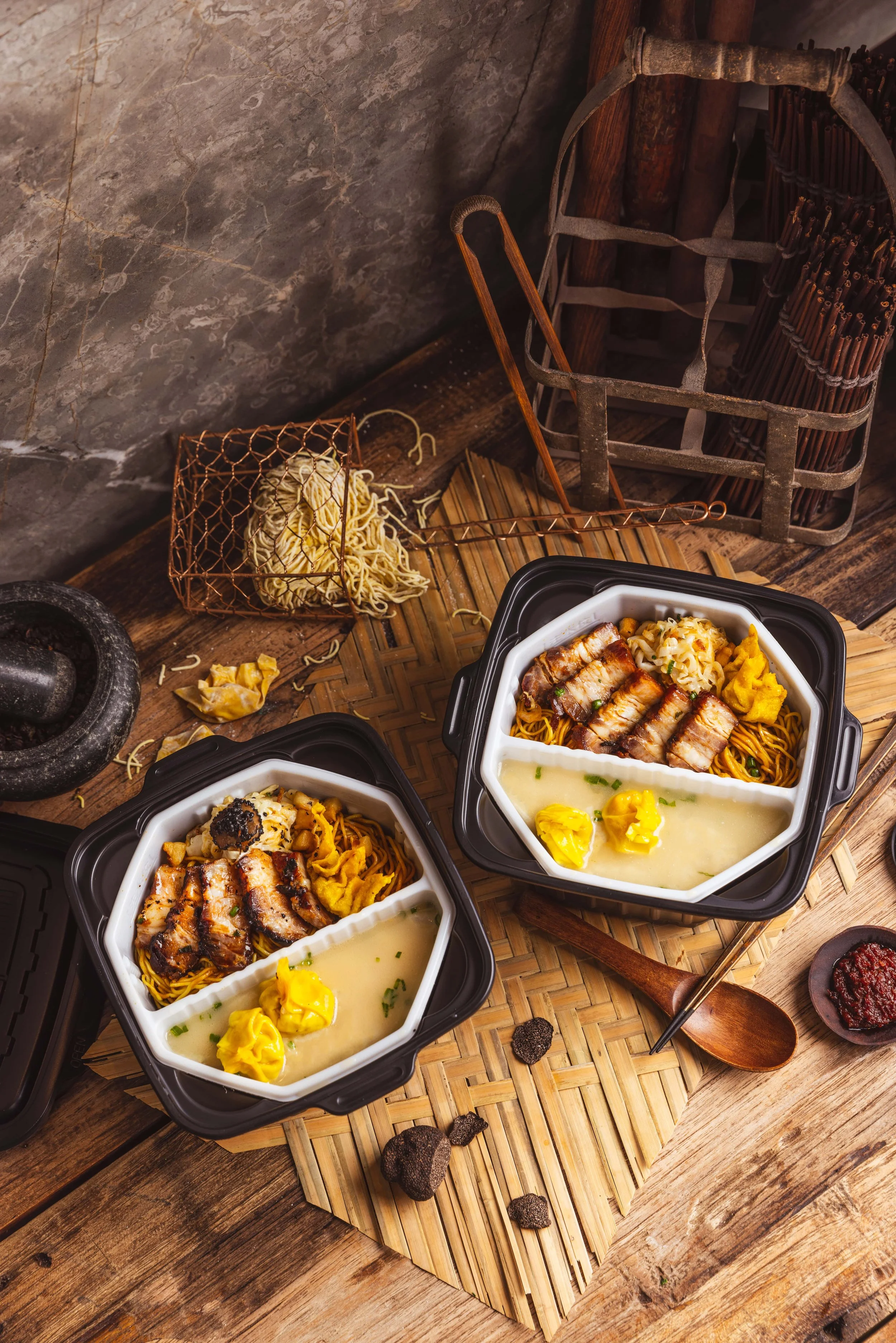
More than just your average bowl of Wanton Noodles, 椿风满面 (Chun Feng Man Mian) is the epitome of artisanal hawker dining. Founded by two F&B veterans on a quest to create the ultimate Wanton Noodles.
We were tasked to develop the branding and food photography for Chun Feng Man Mian’s stall at Amoy Food Centre. In line with the artisanal branding, we elevated the branding with curated serveware, fresh ingredients, and warm overtones that allude to an enticing and inviting meal.
elemen
FOOD PHOTOGRAPHY I BRANDING I SOCIAL MEDIA
FOOD PHOTOGRAPHY | BRANDING | SOCIAL MEDIA
Creatives: C.R Tan (Art Director, Photography, Branding)
Claire Chin (Social Media Strategy & Copywriting),
Lam Jun Yuan (Chinese Copywriting & Design)
Shaun Liew (Videography, Tiktok)
Aye Chan Phyu Sin (Production, TikTok)
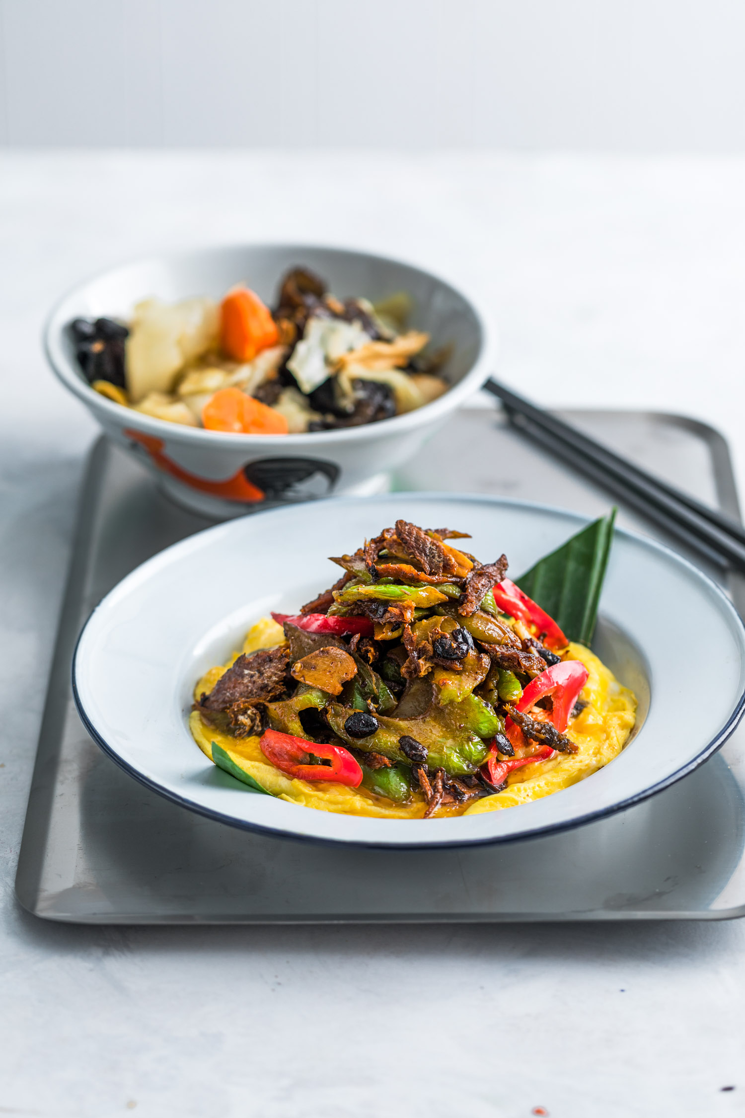
elemen is a dining concept focused on a modern interpretation of natural and meatless cuisine. It is dedicated to fostering the well-being of our customers through our wholesome meatless recipes and the use of natural ingredients.
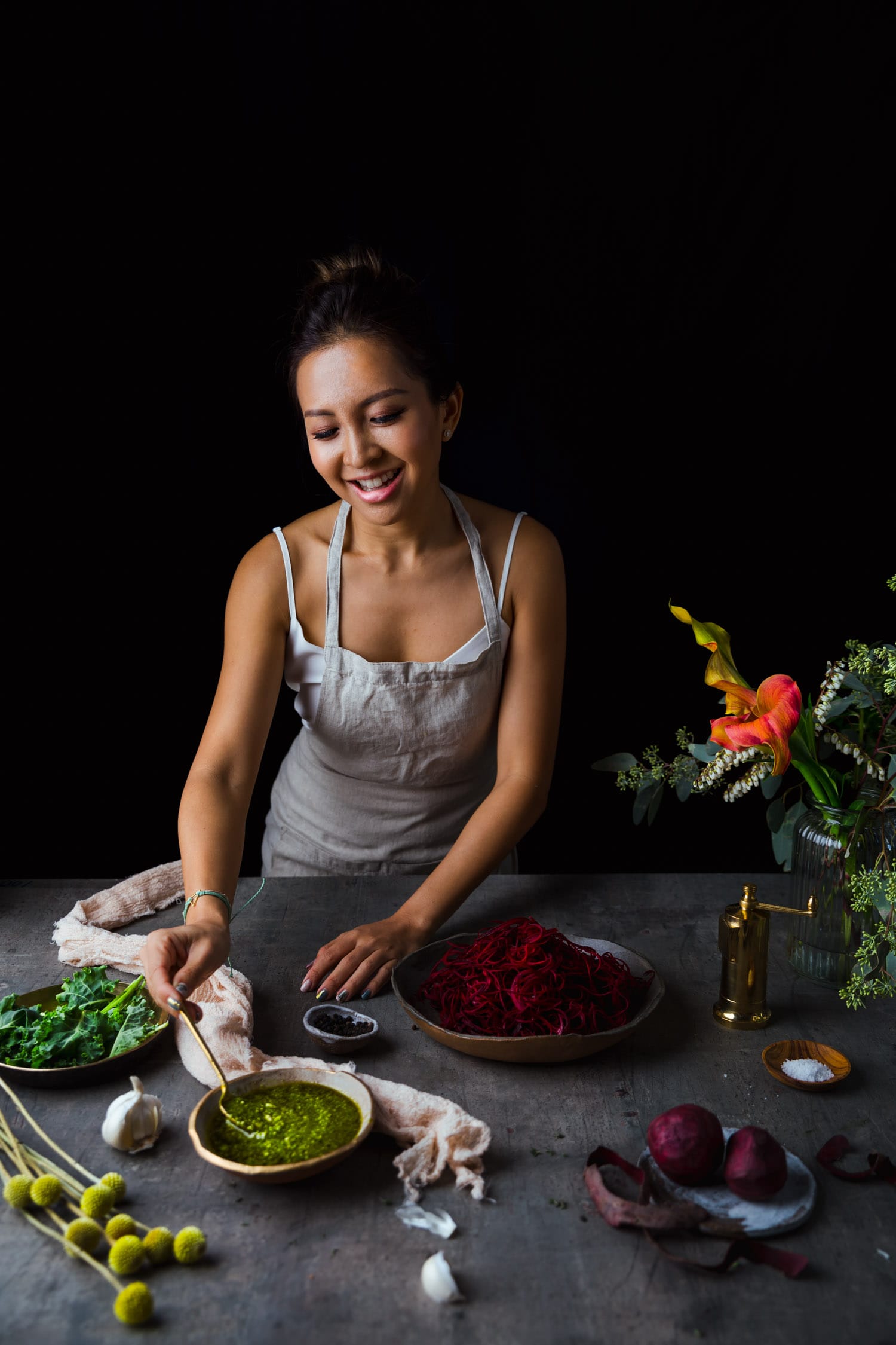
With a focus on wholesome, meatless cuisines, elemen engaged our services for photography, branding (website design) and social media (Facebook, Instagram & TikTok). We focused on highlighting the brand’s motto to “Love self, Love Earth”. We incorporated foliage and vegetation as part of the styling, keeping a fresh aesthetic with green tones as a homage to the logo. As for social media content, we initiated new brand themes, producing content based on trending topics to increase brand awareness and top-of-mind recall.
PHOTOGRAPHY
BRANDING (WEBSITE DESIGN)
SOCIAL MEDIA (FACEBOOK, INSTAGRAM, TIKTOK)
Sourbombe Artisanal Bakery
FOOD PHOTOGRAPHY I FOOD STYLING I DESIGN I COPYWRITING
FOOD PHOTOGRAPHY | FOOD STYLING | DESIGN | COPYWRITING | BRANDING | VIDEOGRAPHY
Art Director, Photographer & Food Stylist: C.R Tan
Designer: Dan Chia
Copywriter: Claire Chin
Photography Assistant: Yeo Yuan Ning
Videographer: Jaegen Tan
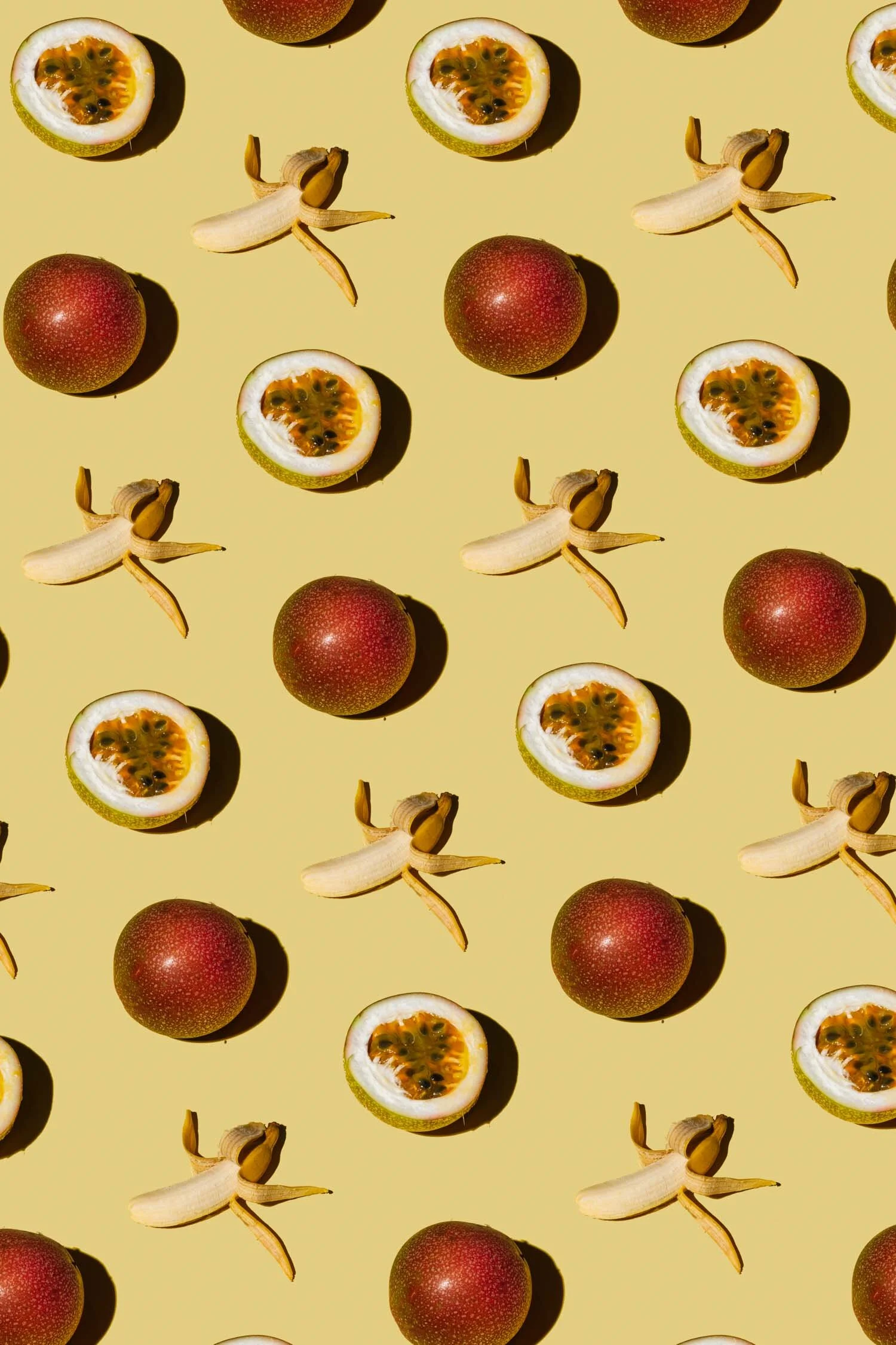
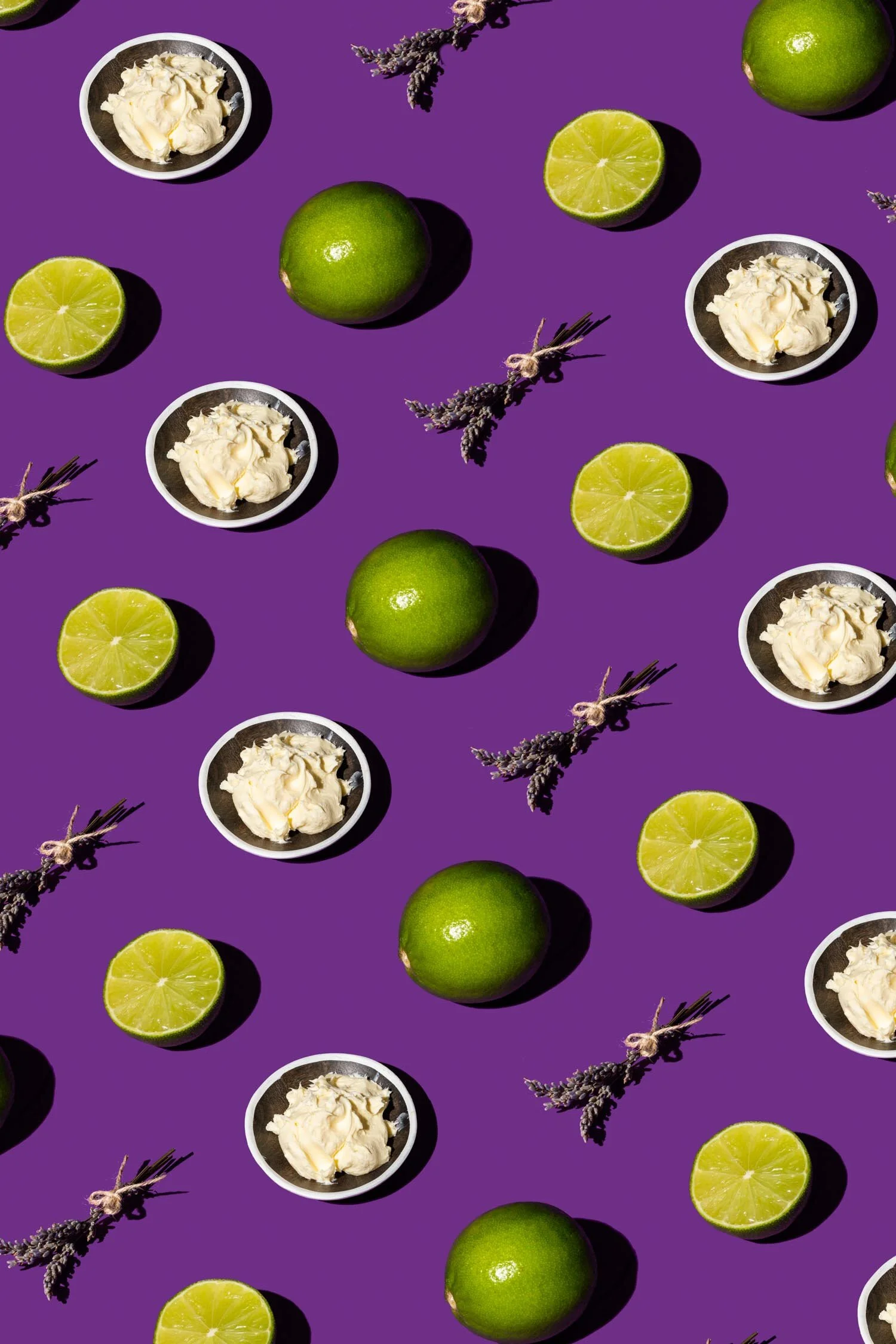
Sourbombe is the innovative mashup of sourdough and Italian Bombolini (‘Bomb’ shaped doughnuts stuffed with pastry cream) but with an artisanal twist. The brainchild of Gen Lee in collaboration with our director C.R Tan, this branding project was conceptualised within a short timeframe of 2 months (during the circuit breaker no less).
With sourdough bombolini at the forefront, we aspired to create a brand that was fun and quirky, hip and trendy. To achieve this, a witty brand voice with ‘bombe’ puns and bright pop colours were used in the design and packaging. Accordingly, vibrant hues and harsh lighting were used in the photography to bring out the delicious flavour profiles of each Sourbombe.
Butler Koffee Cold Brew
FOOD PHOTOGRAPHY I FOOD STYLING I BRANDING
FOOD PHOTOGRAPHY | DESIGN | COPYWRITING
Art Director: C.R Tan
Designer: Dan Chia
Copywriter: Claire Chin
Photographer: Yeo Yuan Ning
It’s been 3 years since Butler Koffee was launched but the COVID-19 pandemic brought about certain challenges where the mobile cart could not operate. Our solution: Cold Brew bottles available for delivery!
This provided a new opportunity for us to relook the branding of Butler Koffee and we decided to revamp it a little, keeping it fun and quirky with vibrant minimalist curves and while still retaining the original charm of Butler’s sincere, warm persona.
Colonial Club
FOOD PHOTOGRAPHY I DESIGN
Located in the heart of Orchard Road, Colonial Club’s menu reflects pays tribute to Singapore’s heritage as a British Colony, serving a myriad of local dishes with a refreshing British Twist. Here, familiar dishes of local hawker food is given a royal treatment, cooked with familiar flavours and presented elegantly. The brief was simple, to showcase the vibrant colours of these dishes, presenting it in a way that was new and refreshing yet rooted in an iconic Singaporean identity.
To achieve this, we made use of simple concrete and marble bases so that the colours of the food could easily speak for itself, creating natural contrast for it to shine. We also sourced for traditional serveware, porcelain bowls, plates and saucers commonly used in households or local restaurants. Finally, we utilised the decor of Colonial Club itself so that the menu could be tied back to the restaurant.
As for the menu design, the emphasis was used on the pictures so that customers could easily and quickly make a decision based on the dynamic shots. The vision was to keep it clean and simple, without too much distraction from the images. Finally, a Peranakan-inspired art deco frame was used for the cover to further accentuate the East meets West/local heritage concept.
Sonoko Sakai Website Rebranding
BRANDING I DESIGN I COPYWRITING
COPYWRITING | WEBSITE DESIGN
Creative: Claire Chin
Sonoko Sakai is a Japanese chef, cook book author and teacher from the sunny hills of Los Angeles. In line with the launch of her book, Japanese Home Cooking: Simple Meals, Authentic Flavors, Sonoko seeked to improve her website with a fresh new look that was also mobile-friendly for her users.
To achieve this, we incorporate photos and illustrations from her book to give her branding a consistent theme. The main challenge was simplifying and streamlining the content in a way that was both aesthetically pleasing but also informative. More importantly, we had to consider the end goal, which was to create a website that was easy for our client to operate/update. Ultimately, we created a triple function website that served as a landing page for Sonoko’s work, a blog for recipe posts and finally an e-commerce site where users cos sign up for workshops or purchase her books.
View the full website here: www.sonokosakai.com
Lunar New Year Corporate Gifting
RECIPE DEVELOPMENT & EXECUTION |PACKAGING DESIGN | COPYWRITING |
RECIPE DEVELOPMENT & PRODUCTION |PACKAGING DESIGN | COPYWRITING
Director & Photographer: C.R Tan
Recipe Development: Ryan Foo
Copywriter: Claire Chin
Designer: Dan Chia
To usher in the year of the golden pig in true Chun Tsubaki fashion, no effort was spared to spread festive cheer and good tidings to our friends and corporate clients. Truth be told, it was a very rushed job but the team worked efficiently to produce their respective collaterals.
The first aspect of our Lunar New Year gifting involved ‘Red Packets’. Red is the traditional colour of the festive season for it signifies warmth, good fortune and prosperity in the spring festival. However, we wanted to refine and redefine these red packets, to allow our design to stand out among the commonplace red packets while retaining oriental elements. Hence, the decision was made to have it in our corporate Navy. blue, with elements of camellias and cherry blossoms, emblems of spring as well as our branding of ‘Tsubaki’.
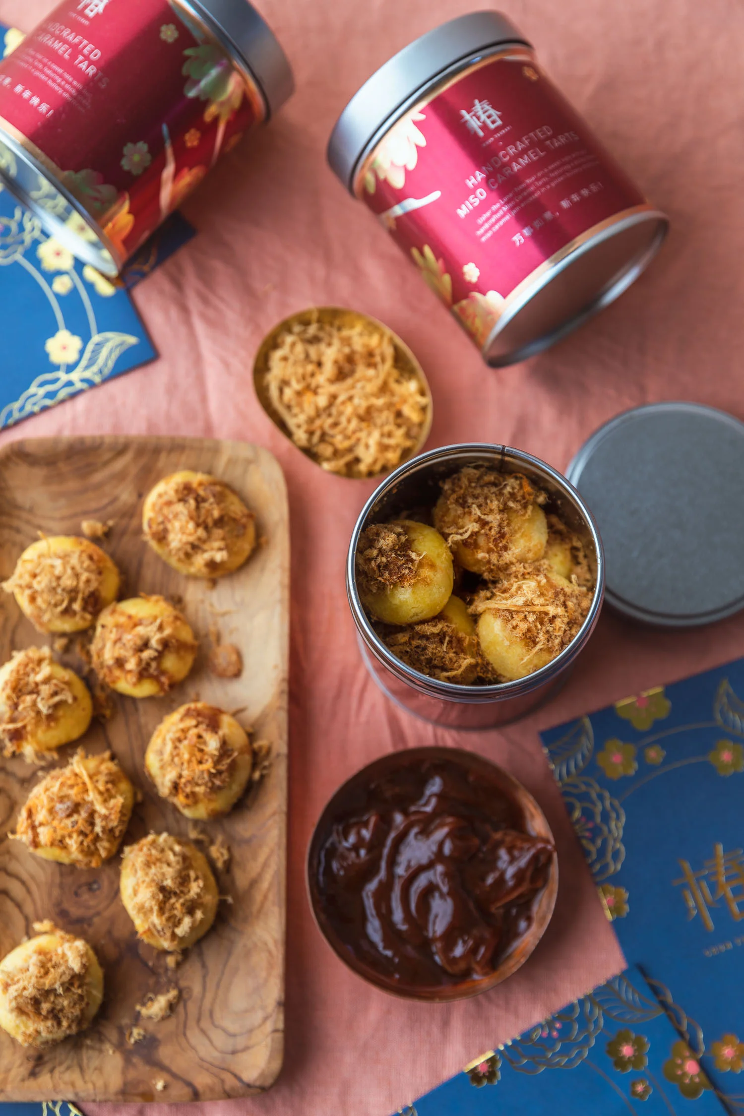
The second element of our corporate gifting was our Miso Caramel Tarts with Pork Floss. Cookies and sweets are often given to friends and relatives, to wish them glad tidings and sweet success. Inspired by Pineapple Tarts, we decided to switch things up with a miso caramel filing encased in a buttery melt-in-your-mouth crust, and finally garnished with pork floss for decadence.
Here’s wishing everyone a joyous and prosperous Lunar New Year, with blessings of abundance and success!
Festive Corporate Gifting: Gula Melaka Marshmallows with Desiccated Coconut
RECIPE DEVELOPMENT & EXECUTION |PACKAGING DESIGN | COPYWRITING
RECIPE DEVELOPMENT & EXECUTION |PACKAGING DESIGN | COPYWRITING
Photographer & Director: C.R Tan
Culinary Consultant: Ryan Foo
Copywriter: Claire Chin
Packaging Design: Dan Chia
In the spirit of giving for Christmas, we decided to whip up some goodies to thank our clients and partners for all the opportunities and projects in 2018. To kickstart the yuletide on a sweet note, the team got together to create the ultimate corporate gift. Chef Ryan whipped up handcrafted Gula Melaka Marshmallows, dusted with desiccated coconut, inspired by ondeh ondeh. The packaging design retains the blue hues of our studio branding with festive elements of Christmas holly and berries.
Live Fruitfully
FOOD STYLING & PHOTOGRAPHY | GRAPHIC DESIGN | COPYWRITING | WEB DESIGN
FOOD STYLING & PHOTOGRAPHY | LOGO DESIGN | COPYWRITING | WEB DESIGN |BRANDING
Creative Director & Photographer: C.R Tan
UX Writer & information Architect: Claire Chin
Graphic Design: Dan Chia
As part of a rebranding exercise, our client Sandra tasked us to redesign her logo and website, together with fresh new photos to promote her platform Live Fruitfully. As a plant-based consultant, Sandra seeks to share her personal story and to inspire her clients to eat and live well hence the challenge was to find the optimal mix to design her website professionally while telling her personal story.
Butler Koffee
BRANDING|FOOD PHOTOGRAPHY
BRANDING|food PHOTOGRAPHY
Photographer: C.R Tan
Designer: Dan Chia
Copywriter: Claire Chin
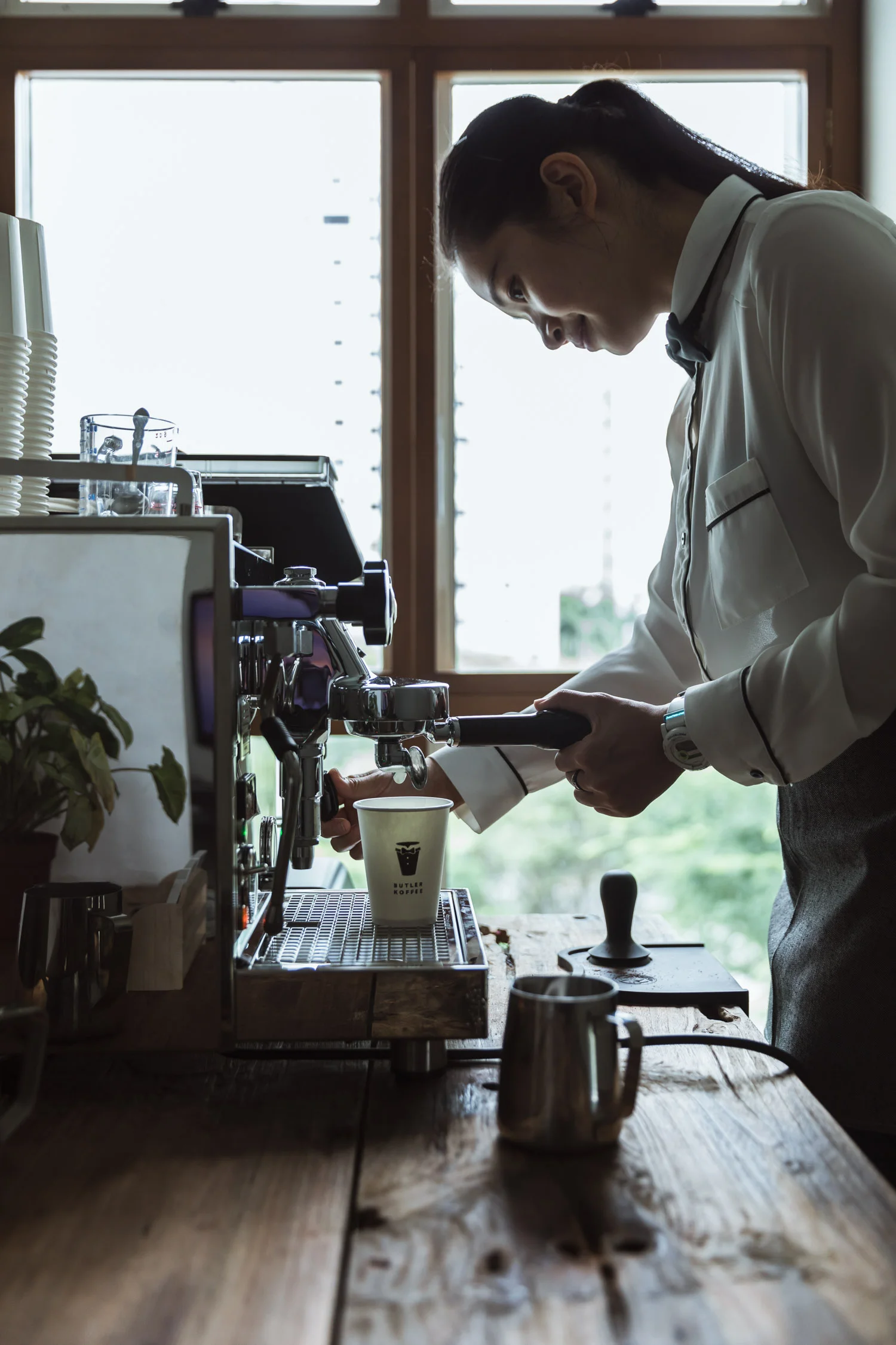
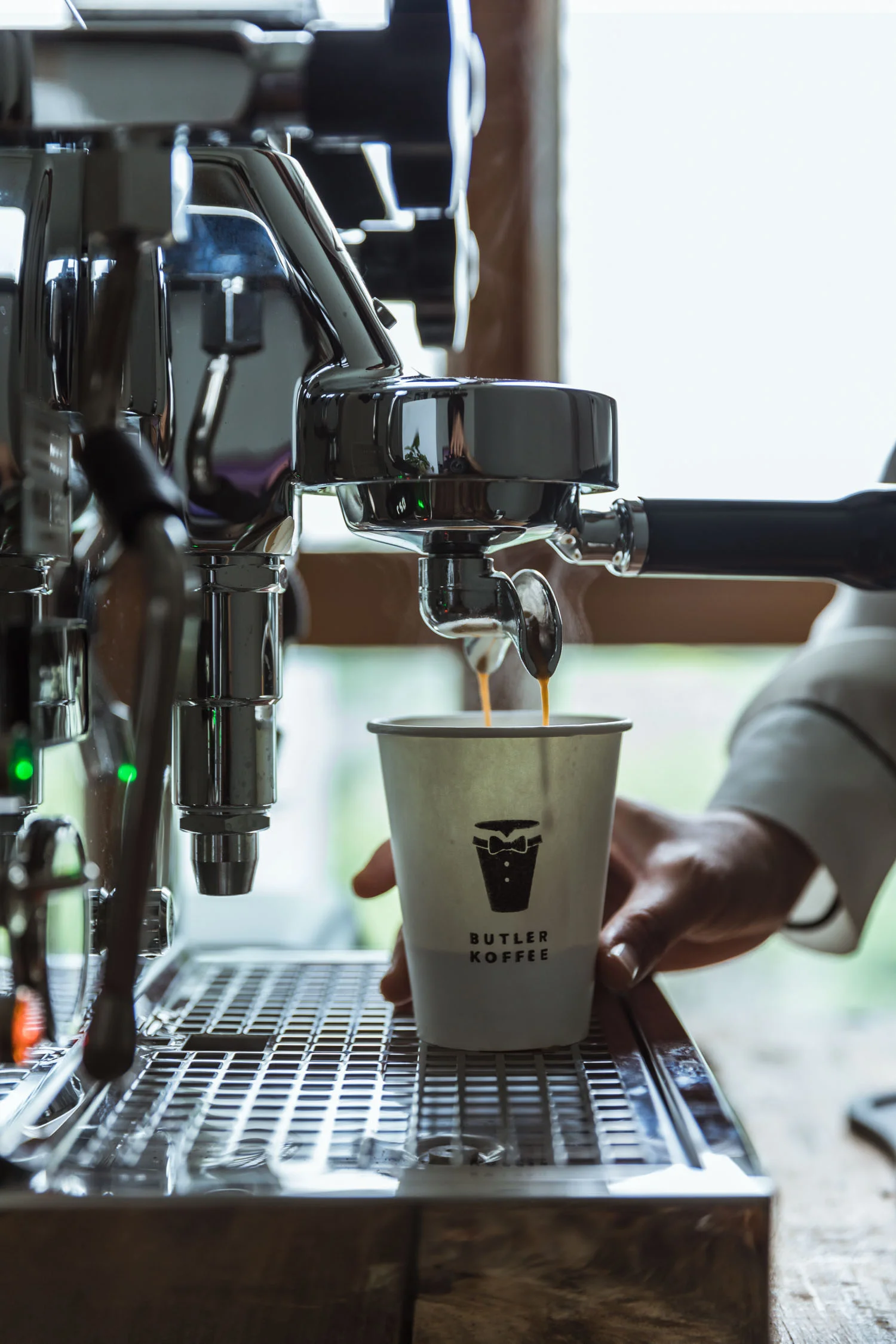
Fresh on the coffee scene, Butler Koffee is a specialty coffee mobile cart that provides intimate coffee services for private and corporate events. Inspired by founder Alicia Yap, who began her career as a Butler in the UK, we decided to use this as the focal point for the branding. Hence, the logo was adapted from a classic dapper tuxedo. To further highlight the bespoke experience, the photos and copy for Butler Koffee's website and social media platforms placed an emphasis on the human touch to evoke the warmth and sincerity of their handcrafted coffee and personalised service.
Kyu Coffee Bar
BRANDING|PHOTOGRAPHY|STYLING|COPYWRITING
BRANDING|PHOTOGRAPHY|FOOD STYLING|COPYWRITING
Art Director & Photographer: CR Tan
Graphic Designer: Dan Chia
Logo Designer: Roxanne Wee
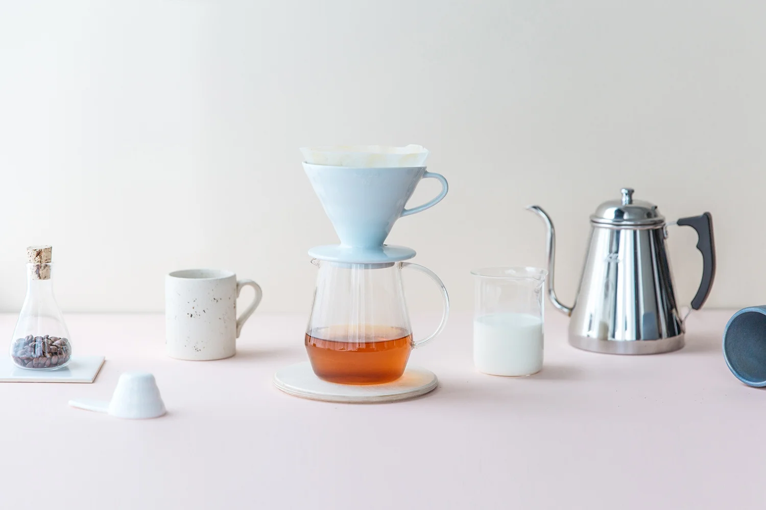
KYU Coffee Bar is a specialty coffee kiosk launched by Nine Press Group, nestled in the heart of the Central Business District. Based on the ideals of minimalism, we drew inspiration from Japanese Zen for the KYU Coffee Bar's branding. The idea was to encourage simplicity seeking in the hectic pace of life in today's world, and finding a moment of tranquility while savouring a freshly brewed cuppa coffee. Hence for the art direction, we employed a pastel colour scheme paired with light blush hues to evoke a sense of genuine warmth and cordial service.
NINE PRESS GROUP
BRANDING|ART DIRECTION|PHOTOGRAPHY
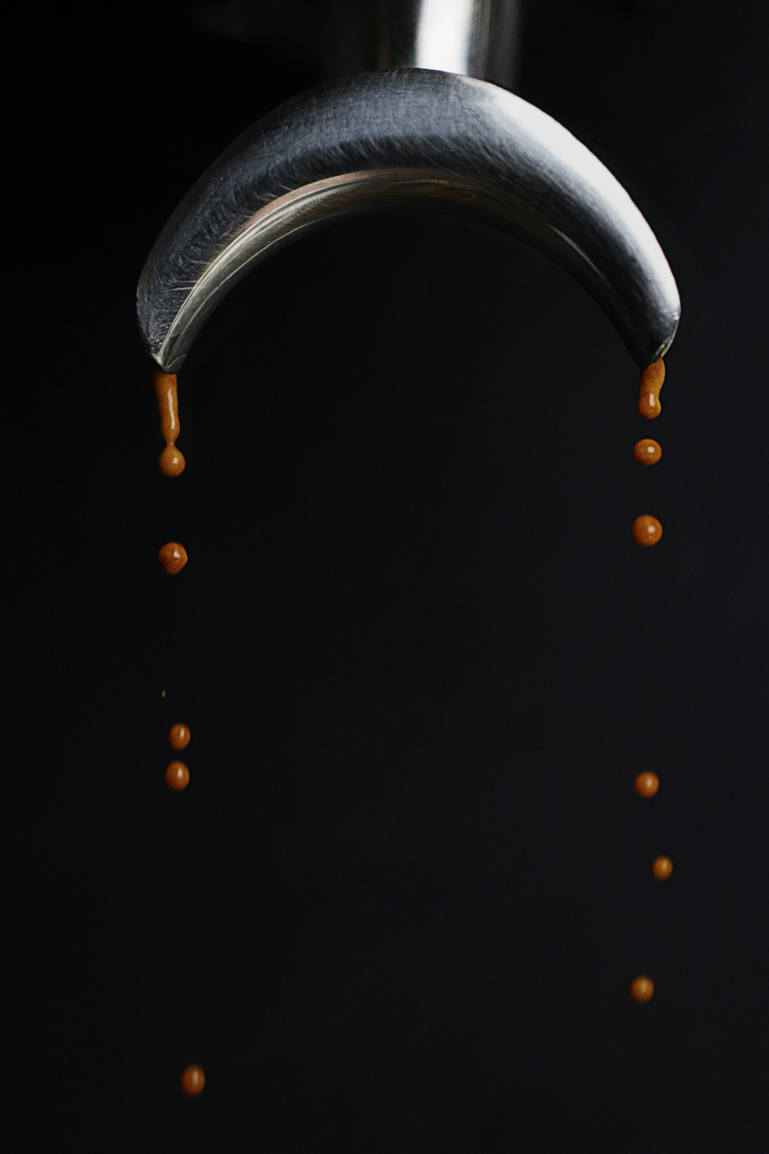
Ninepress is an online coffee portal built on the love and passion for coffee and its craft. As a new and slightly indie collective, we decided to go for a simple yet distinctive design for the logo for it to easily gain top-of-mind recall. Hence, we adjoined the numerical '9' and latter 'P', pairing the monogram with an edgy san serif font. As for our photography direction, we opted for a dark mood, capturing subjects up-close in their natural aesthetic to illuminate the natural beauty of coffee beans and the process.


